Redesigning a high traffic landing page that resulted in +13% user conversions.
details
starz
product designer
mobile, web
context
The STARZ landing page is a high traffic entry point, and should serve as an introduction to the rest of the app experience in order to convert users. This is where users see value props and pricing info.
I redesigned the landing page to draw users in immediately, and the new experience drove a 13% increase in user complete conversions.

context
Starz's landing page felt inconsistent with its content.
Starz's main app is moody and dark to match its racy content. But the marketing page most user's land on before subscribing? Light, boring, generic.
As a team, we knew there was potential to up our conversion rates from this high-traffic page, but wanted to make sure that bringing Starz's bold branding here wouldn't drive users away.

scope constraints
Due to limited time and descoping, redesigning the entire landing page was slated as a future project. For this project, I focused solely on the header, since it would be a lot of users' first introduction to Starz.
past a/b testing
Several iterations of the landing page (not designed by me) had been tested before…
…But none increased user conversions, and all used the same light theme.
Given the results of these A/B tests, I knew that I'd need to do some deeper testing with users.

What info do they want to see here? What drives them away? Why do they click or not click?
key user insights
To get to the bottom of things, I conducted usability tests, but results were unexpected.
I conducted usability tests with dark and light versions of the landing page and found out that page color affects users' perceptions of the content itself.
Users who didn't like Starz's typical R-rated content literally let out a sigh of relief when I showed the current (light) marketing page.
They called it "nice", "informational", "boring", and "safe".

Users who did have an interest in our content (our target audience) preferred the dark version.
They used the words "luxurious", "sleek", "adult", "modern" to describe it.
that's what we want to hear!
solution
I knew that I needed to let users know exactly what they were getting with Starz to increase conversions here.
I wanted our target audience to get the "luxurious, adult" experience they seek, and also have all the info users told us they needed to convert.

dynamic introduction
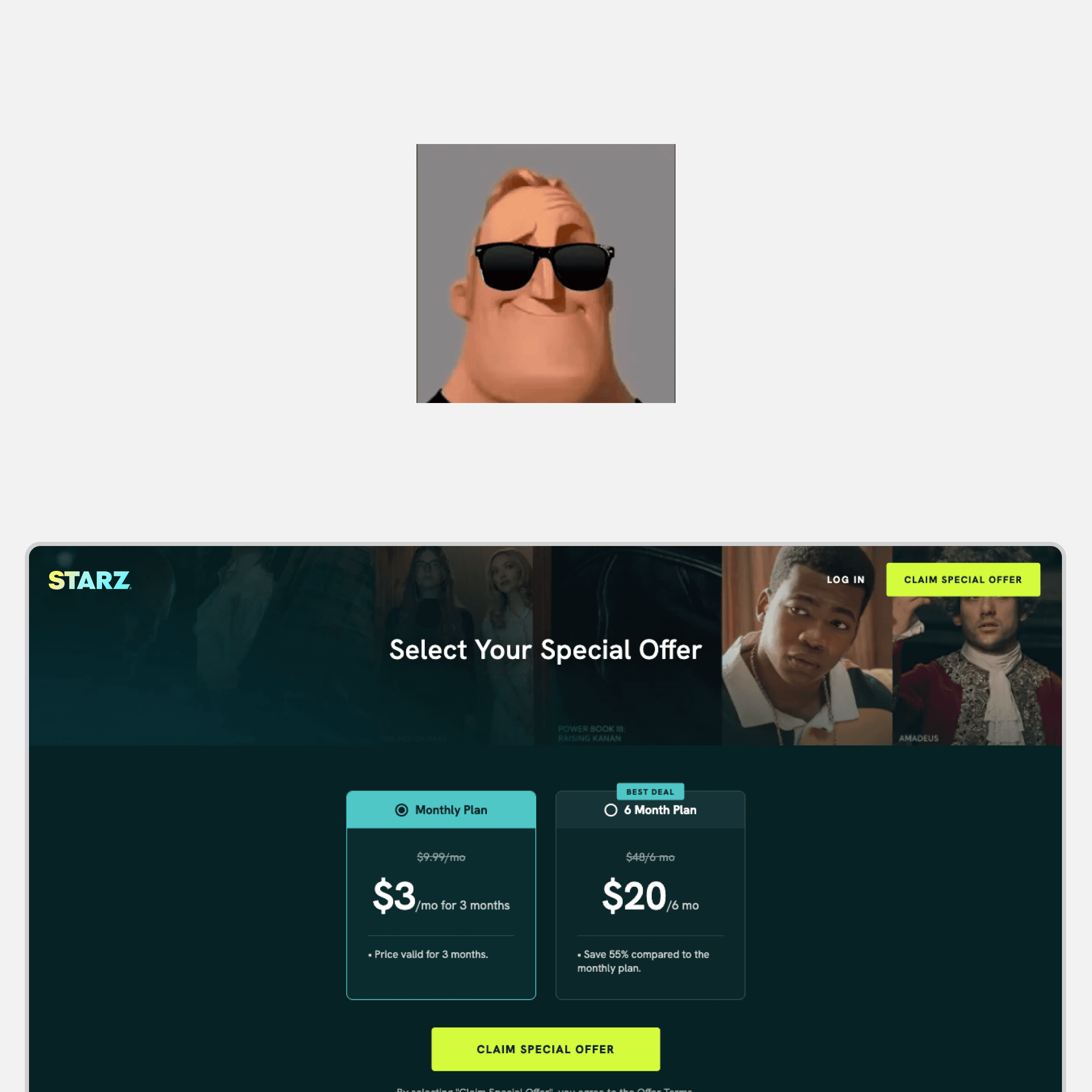
A dynamic fullscreen marketing image shows prospective users exactly what Starz has to offer immediately, with a fallback image for when no tentpole series is airing.

Transparency in pricing
Instead of burying subscription prices further down the page, having this information above the fold gives users the context they need to evaluate the offer immediately.
responsive design
I worked with developers over several long conversations to make sure the new header images worked at all screen sizes.
I also used a sticky CTA on mobile devices to keep it above the fold and reformatted pricing/marketing content depending on screen size.

There was a lot of back and forth with developers on this one … but it was totally worth it
impact & outcomes
During initial tests of the new header, user complete conversions increased by 13%.
My hypothesis for why this happened (because validation testing was not available):
✢
We showcased popular featured Starz content
✢
We reduced friction with upfront pricing and CTA
✢
We immediately introduced the tone of the app to our target audience
what i learned
Research is direction!
Research confirmed some of my assumptions, but also revealed priorities I hadn't considered.
The final solution came from listening to users rather than designing blind.