Driving content discovery through a cross-platform Top 10 streaming experience.
details
starz
product designer
mobile, web, tv
context
The Top 10 feature in the STARZ app reduced subscription cancellations by 4% across a user base of over 19 million subscribers, increased views to top 10 titles by 400%, and increased average user session lengths by 13%.
As the lead product designer on this feature, I led the design from research and discovery phases to implementation and QA.

context
STARZ's streaming apps look like one big block of content.
From past user interviews I conducted, I knew that users prefer varied image sizes to ‟break up" the screen, especially on larger TV screens.
With 74% of STARZ users being over 35, image size was a huge factor in our user's browsing experiences.

competitor Landscape
Competitors all have one thing in common…
They introduce visual variety through mixed aspect ratios and sizes, and a rotating Top 10–15 list keeps content fresh.
From my own experience, I know it’s often one of the first places people look for something to watch.

design discovery
I tested multiple iterations of a top 10 design and decided to keep things simple.
I designed multiple number variants and put them through an AI eye tracking software called FengGUI to test what designs would be most eye-catching on the screen and lead the most traffic to the top 10 titles.
I took the winners of that test and simplified designs to only include numbers & thumbnails for an A/B test.
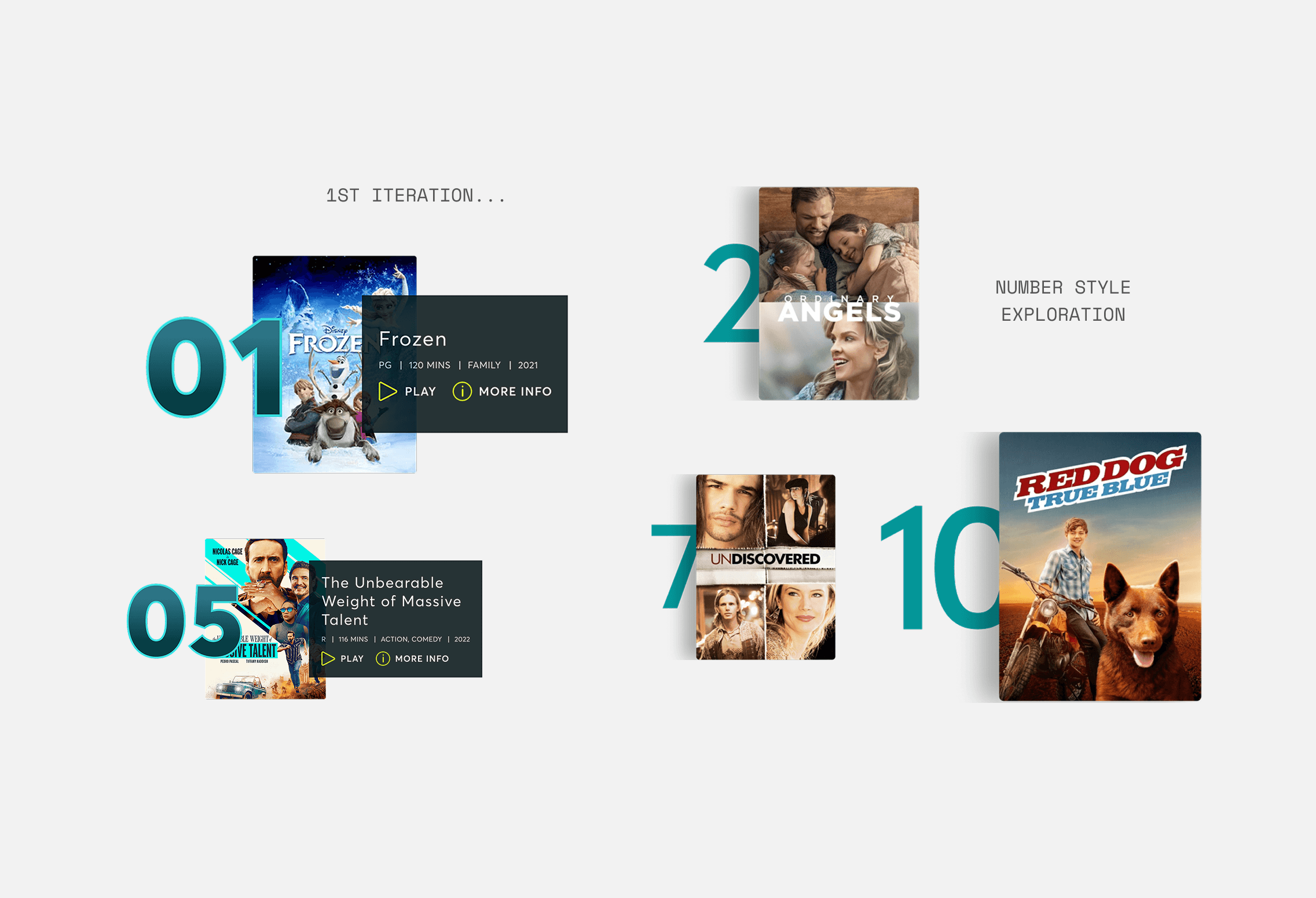
my first iteration had wayyy too much going on… what information do users want to see here?
solution
When tested against the current experience, we saw a 4% decrease in cancellations and a 400% increase in visits to the 10 titles.
My hypothesis: we called attention to the best & newest content → users are finding what to watch faster → users are less inclined to cancel subscriptions due to lack of content & more inclined to explore popular titles. Win!


2 years later, STARZ had evolved to embrace a more video-centric browsing experience.
To align with that, I tested a version of the Top 10 list that incorporated auto-playing trailers.
These initial tests saw a 3.3% increase in average session length amongst users who interacted with the feature.
autoplaying trailers
As you hover your focus on or select a number, a trailer seamlessly starts to play.
I know it's controversial, but after referencing some past user research, we realized most of our target users actually appreciated autoplay videos.
↑ example of being
proven wrong by users!
smaller screen affordances
At smaller breakpoints, I removed descriptions and downsized title art in favor of a larger video player.
(backend limitations meant no video on mobile unfortunately)

ai-tested designs
Designs were tested again using AI eye-tracking software, where a slightly updated version of my original numbers won against more subtle number designs.
example pictured here of the AI eye-tracking software
impact & outcomes
What started as a simple list to boost discovery resulted in:
✢
4% reduced subscription cancellations
✢
400% increased visits to the top 10 detail pages
✢
Increased average session length by 13%
This feature reinforced how much real results matter. They build trust, and trust gives design more room to explore.
It also struck a good balance between business needs, user needs, and what I wanted to design, which is always the goal ☻